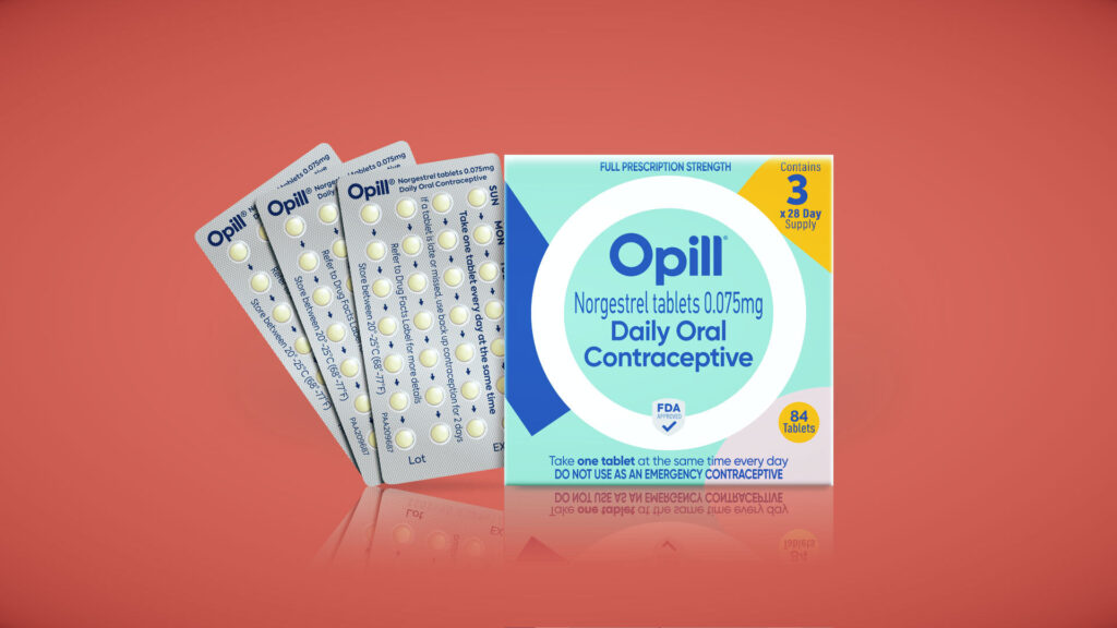
It’s not every day that a marketing team is tasked with designing the branding and packaging of the first over-the-counter birth control pill to be sold in the U.S.
This was the challenge, and the opportunity, faced by the team behind Opill, the landmark pill from drugmaker Perrigo that received approval from the Food and Drug Administration earlier this month. Their brief: Create a design that would stand out in America’s notoriously sprawling pharmacy aisles; inspire trust and confidence; be easy to remember and recognize; appeal to women — including teenagers — as well as trans men and nonbinary people; clearly communicate its purpose; be simple to carry and use; contain straightforward but accurate user information; and clear FDA requirements.
Settling on the right approach took years of research and testing, which resulted in the name Opill and packaging featuring bright teal, saturated pink, and yellow, as well as a rounded font reminiscent of millennials’ ubiquitous favorite Gotham. All of these features are intended to set the product apart from the dozens of prescription contraceptive pills available in the U.S. market and internationally.


